
I led product design across operational workflows and AI-assisted experiences from 0→1 at Akordi
I led product design across operational workflows and
AI-assisted experiences from 0→1 at Akordi


Akordi is a construction risk management platform that helps engineers and risk managers surface and act on risk across major capital projects.
Context
My Role
Led end-to-end UX/UI, information architecture, and design system governance. Managed 1 direct report.
Team size
Product Lead, 3x Product Managers, UX/UI Designer (1 report), Engineering team
Timeline
Initial release → 4 months, Pilot ongoing
Problem
Over 90% of major capital projects face delays and cost overruns. The expertise to prevent this exists — accumulated by specialists across decades of complex delivery. But that knowledge is project-specific and rarely survives when teams move on.
Specialists trust their own judgment, knowledge-based tools have low adoption with no project lifecycle coverage, and standard reporting is slow and poorly documented.
Stakes are high, knowledge is locked up and fragmentation is a problem multiplier
Outcome
Shipped 2 pilots, launched to 40+ active major programs in the UK and Australia — 6 product releases, 12+ features, serving 4 distinct user role types from project specialists to executive stakeholders.
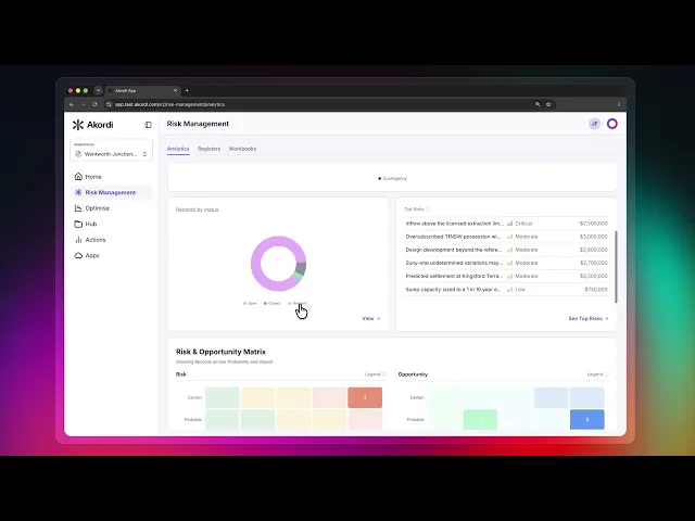
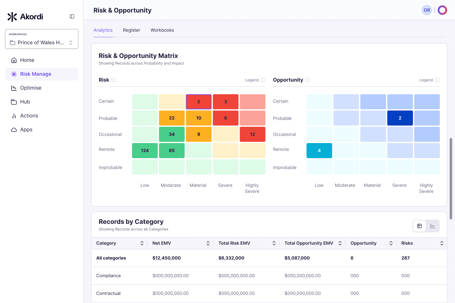
Designed the platform's core operational infrastructure — a risk record system (CRUD) and canvas-style workshop functionality with embedded commenting, document management, activity logging and action tracking; integrated analytical dashboards feeding workspace risk data; and a contextual AI chat that integrates with workspace risks
The Akordi platform establishes a shared operational layer across risks and project teams, improving visibility, standardisation, and most importantly, quicker decision-making in complex construction environments.
“Jonathan doesn't wait for PRDs or prototypes to start solving a problem. He asks what's driving it, not just what's in front of him. That's why he thrives in the ambiguity of a 0-1 product.
He's creative and measured in execution, delivers quality work, and owns it all the way through.”
William Morris, Head of Product, Akordi
LinkedIn
Operational shared layers with roll-up dashboard
AI chat with contextual awareness and detailed risk record entry

Document management

"It would be really easy to get the team using it collectively and adopt it as our main platform for managing risk."
Pilot user
See the full case study ⏤ 10 min read
Show
Design Problem
The platform serves 4 distinct user types across two contexts: portfolio-level leaders who need signals and summaries, and on-the-ground project managers who need operational depth. Early SME workshops surfaced the gap — risk managers were skeptical and Excel-comfortable, executives were excited about AI summarisation and decision-level tooling, without consideration to impact of reliable input.
Trust in AI-generated outputs was contested across both groups.
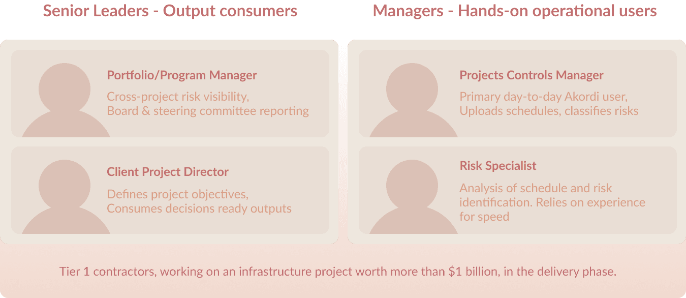
The product needed to serve two fundamentally different modes of use: aggregate data review with gated workflows for decision makers and a fast/slow split for operational users;
Fast, collaborative risk capture in workshop conditions, and deep analytical work where a single risk might carry dozens of attributes, sub-risks, and linked documents.
Designing one platform that didn't force a tradeoff between those two modes shaped every structural decision that followed.
Operational structure
Akordi was a 0→1 product — with few viable market benchmarks. First releases were shipped with offshore development team, a security-background engineering lead, and a BA-heavy structure. Although the people were capable, the challenge was that the delivery model wasn't built for fast product work.

Design System
I chose Untitled UI with Tailwind for 2 reasons: commercial positioning (the market's incumbent tools looked like they were built ten years ago and were non public-facing) and customisation headroom as we had scoped canvas-based tools and high levels of flexibility (think workflow builders) in early design sprints.
I decided to build the system on a need-only basis — no attempt at full component coverage upfront. Base coverage first, then expand as the product demanded. The priority was fast output and future flexibility, not a comprehensive library that would become overhead before the product had found its shape.
Over several releases I set out governance to help that reduced over-documentation and increase inter-team comprehension
Base/variant guideline to track component variations
Delivering base-line component needs (API, props etc) as part of UI-toDeveloper hand-off.
Archiving valuable descoped work.
I created a feature value scoring to increase product flexibility and reduce cross-team friction
Pattern library covering Akordi-specific UX patterns that didn't exist in Untitled UI's kit.

Requirement to Product workflow
By Release 4 tech debt was building and frustration was growing because quality issues were not being addressed, and the decision was made to migrate UI to Ant Design. I Raised three objections:
Ant's rigid token structure didnt support the component-level customisation outlined for flexibility outlined in design sprints and that had already been released (Workbook feature specifically)
The commercial look and feel we'd established would be eroded;
Managing a DS migration alongside an already stressed release timeline and would compress delivery capacity at exactly the wrong moment.
Technical efficiency was given priority and it was decided that migrating was the right move
It was a difficult transition. Engineering was hesitant to commit to dates, creating an temoprarily sustained dual-library, where the product team had to design features in both systems simultaneously. Delivery capacity was stunted and some product work doubled. However, by R7 we had achieved 85% transition.
Library learning curve
Untitled UI with it’s recent react code library, or ShadCN (styled correctly), would have given the offshore team a more developer-friendly foundation from day one — and removed the justification for the migration entirely.
In retrospect, the product teams ambition was not aligned with operational realities. An important lesson on alignment and capacity!
File Management
Hub shipped first — a document repository for project contracts, reports, and site records.
We kept a flat, table structure— list over folders. Hierarchical folder logic added engineering overhead pilots didn't need and we left out versioning, a requested feature.
More than anything, Hub was about overcoming operational challenges.


Register + Drawer
The Register solved a different problem — management, not identification. Structured housing for risks to be compared, tracked, and updated over time.
A table with adjustable sorting, filters, and show/hide fields, mirrored the shape of LOR's existing risk tool — clunky, widely avoided, but field-familiar — but gave us the opportunity to solve existing usability problems while gaining internal credibility.
Legacy risk management solution

The Risk Drawer was a challenge. Every risk needed to be a complete record: EMV assessments , attachments, comments, interlinked risks...an accessible item that could be edited, from any workflow.
I decided on a drawer. It maintained workflow context, allowed for scalability (managed content with tabs) and was global positioned (it wouldn’t be out-grown as the product matured). A manager could be mid-analysis in the Register — filtering by EMV across thirty open risks — open a risk directly, update an assessment, and return to the same filtered view without losing their place.

Early exploration

Evolution over several releases

Shipped Register with Drawer as of Release 6
Workbook
Workbook was our flagship feature.
The original vision was an open canvas, where users could edit, create and update 'card' details — giving teams the flexibility to build risk profiles within a flexible environement.
Users would create Risks manually in the Canvas, but with AI as a value multiplier. User pulls documentation from Hub, AI surfaces a first-pass risk set on the canvas for review, challenge, and qualification. The human owns the judgment.

Earlier mocks inferred open canvas flexibility
I pushed for flexibility and speedy CRUD; free card positioning, inline editing, and tree-node relationships managed on the canvas — not in external panels. However, across multiple decision points the open canvas was progressively constrained.
Controls moved to side panels, card interaction reduced and moved into a drawer and Bulk CRUD was descoped. Each decision had a rationale, but cumulatively, the Workbook shifted away from an open, fast identification environment toward something structurally similar to the Risk Register (risk management feature) — two features that now overlap in ways users notice and individual feature value eroded.

Exploration on Canvas interactions, with principle features in place

AI workflow. Final shipped version, had a much less flexible experience, but delivered on promised functionality
Navigation
Akordi serves user types with very different workflows — Forcing both through the same navigation added irrelevant surface area for everyone. This came sharply into focus as Workbook, Hub and Risk started to take shape.
I workshopped a modular approach with the Product Lead. This allowed flexibility for future scale as well provide an accessible “centre” to the product. Register, analytics, workbooks and other functions would be tabbed in a central content area under focuses (risk, schedule, document management, AI etc). Users move through their domain without unnecessary context. I
mportantly, modules could be expanded, permissioned, personalised and even removed independently as the platform grew.

Primary navigation with central content area

Concept iterations started at compacted sidebar but eventually landing on a simpler, reveal-all sidebar with optional collapse all
Workspaces handled project hierarchy — a parent/child model where child workspace data aggregated upward and permissions trickled down, giving users the flexibility to mirror their real project, milestone, and portfolio structures. For the pilot, scope for workspace management would be managed on the back end as we onboarded clients.
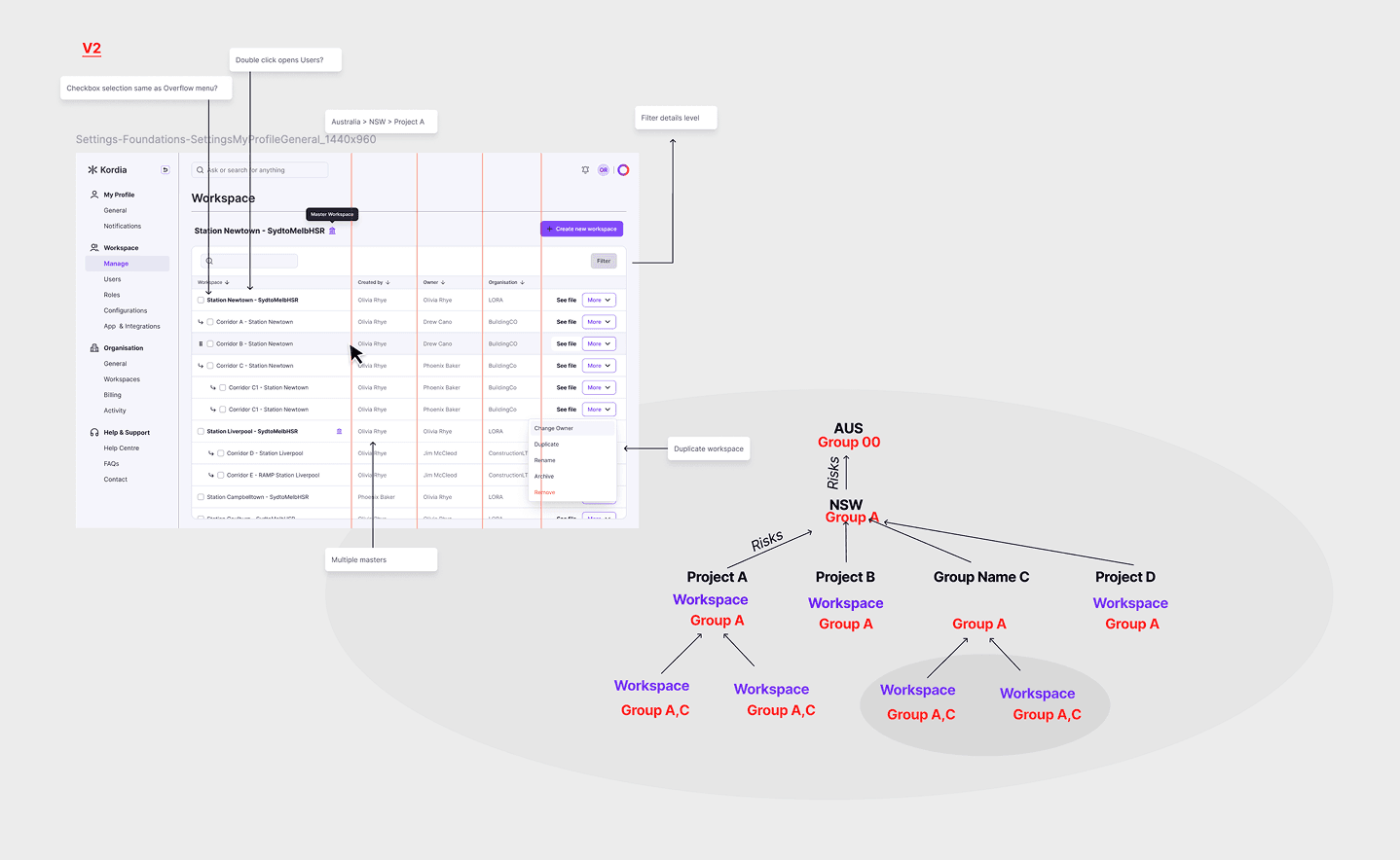
Over multiple workshops permissions, user roles and workspace defaults took shape
Akordi AI
I designed the interaction model across several AI surfaces.
The most challenging feature was scaling our AI assistant to have context envrionments

Early exploratory work
We aimed for a rapid risk-retrieval use case: users wanted to query the risk database in natural language and surface specific risks. Tool overlap became a key concern — the Risk table toolkit already offered deep filtering and sorting for users who knew exactly what they were looking for.
AI chat needed to address the other end of that scale: fast, exploratory retrieval for users who didn't know the right filters, or simply wanted an answer faster than clicking through them.
It also became apparent to me early on, that our current 'Clarify first' AI principle which was built for the AI experience in Workbook and out of backend constraints, was going to poorly impact the chat experience. It lacked a user-centric approach.

Risk context for AI chat was shipped in Release 6
The Workbook could not effectively ‘stage’ generated risks/responses. This meant from a technical perspective, putting large amounts of Risks on the screen was heavily lifting. ‘Clarify first’ approach helped mitigate that load as well as confirmed user intent. At least until we could tackle front-end ‘staging’ more effectively in a future release.
The Chat interface was free of that burden. Applying the same principle would result in the AI asking multiple clarifying questions before delivering on a user prompt. I advocated applying an 'Act first' principle, arguing that the AI chat interface was a low risk environment, both technically and from the user's perspective.
Shipped to date
As of July 2026, base features include:
Risk Register (table)
Risk Data entry
Risk Identification Canvas (AI assisted workflows)
Risk Record activity log
Risk Record - Attachment
Home page
Apps integration page
AI Chat assistant (with context environments )
Hub - document management
Action/Task Register (table)
Action Record entry
We've also scaled horizontally, particularly on Risk functionality; additional features have been added including, risk escalation (escalate and de-escalated a risk), shared commenting on individual risk records and risk close-out (permission and role gate).
See the full case study ⏤ 10 min read
Show
Design Problem
The platform serves 4 distinct user types across two contexts: portfolio-level leaders who need signals and summaries, and on-the-ground project managers who need operational depth. Early SME workshops surfaced the gap — risk managers were skeptical and Excel-comfortable, executives were excited about AI summarisation and decision-level tooling, without consideration to impact of reliable input.
Trust in AI-generated outputs was contested across both groups.

The product needed to serve two fundamentally different modes of use: aggregate data review with gated workflows for decision makers and a fast/slow split for operational users;
Fast, collaborative risk capture in workshop conditions, and deep analytical work where a single risk might carry dozens of attributes, sub-risks, and linked documents.
Designing one platform that didn't force a tradeoff between those two modes shaped every structural decision that followed.
Operational structure
Akordi was a 0→1 product — with few viable market benchmarks. First releases were shipped with offshore development team, a security-background engineering lead, and a BA-heavy structure. Although the people were capable, the challenge was that the delivery model wasn't built for fast product work.
Design System
I chose Untitled UI with Tailwind for 2 reasons: commercial positioning (the market's incumbent tools looked like they were built ten years ago and were non public-facing) and customisation headroom as we had scoped canvas-based tools and high levels of flexibility (think workflow builders) in early design sprints.
I decided to build the system on a need-only basis — no attempt at full component coverage upfront. Base coverage first, then expand as the product demanded. The priority was fast output and future flexibility, not a comprehensive library that would become overhead before the product had found its shape.
Over several releases I set out governance to help that reduced over-documentation and increase inter-team comprehension
Base/variant guideline to track component variations
Delivering base-line component needs (API, props etc) as part of UI-toDeveloper hand-off.
Archiving valuable descoped work.
I created a feature value scoring to increase product flexibility and reduce cross-team friction
Pattern library covering Akordi-specific UX patterns that didn't exist in Untitled UI's kit.
Requirement to Product workflow
By Release 4 tech debt was building and frustration was growing because quality issues were not being addressed, and the decision was made to migrate UI to Ant Design. I Raised three objections:
Ant's rigid token structure didnt support the component-level customisation outlined for flexibility outlined in design sprints and that had already been released (Workbook feature specifically)
The commercial look and feel we'd established would be eroded;
Managing a DS migration alongside an already stressed release timeline and would compress delivery capacity at exactly the wrong moment.
Technical efficiency was given priority and it was decided that migrating was the right move
It was a difficult transition. Engineering was hesitant to commit to dates, creating an temoprarily sustained dual-library, where the product team had to design features in both systems simultaneously. Delivery capacity was stunted and some product work doubled. However, by R7 we had achieved 85% transition.
Library learning curve
Untitled UI with it’s recent react code library, or ShadCN (styled correctly), would have given the offshore team a more developer-friendly foundation from day one — and removed the justification for the migration entirely.
In retrospect, the product teams ambition was not aligned with operational realities. An important lesson on alignment and capacity!
File Management
Hub shipped first — a document repository for project contracts, reports, and site records.
We kept a flat, table structure— list over folders. Hierarchical folder logic added engineering overhead pilots didn't need and we left out versioning, a requested feature.
More than anything, Hub was about overcoming operational challenges.
Register + Drawer
The Register solved a different problem — management, not identification. Structured housing for risks to be compared, tracked, and updated over time.
A table with adjustable sorting, filters, and show/hide fields, mirrored the shape of LOR's existing risk tool — clunky, widely avoided, but field-familiar — but gave us the opportunity to solve existing usability problems while gaining internal credibility.
Legacy risk management solution
The Risk Drawer was a challenge. Every risk needed to be a complete record: EMV assessments , attachments, comments, interlinked risks...an accessible item that could be edited, from any workflow.
I decided on a drawer. It maintained workflow context, allowed for scalability (managed content with tabs) and was global positioned (it wouldn’t be out-grown as the product matured). A manager could be mid-analysis in the Register — filtering by EMV across thirty open risks — open a risk directly, update an assessment, and return to the same filtered view without losing their place.
Early exploration
Evolution over several releases
Shipped Register with Drawer as of Release 6
Workbook
Workbook was our flagship feature.
The original vision was an open canvas, where users could edit, create and update 'card' details — giving teams the flexibility to build risk profiles within a flexible environement.
Users would create Risks manually in the Canvas, but with AI as a value multiplier. User pulls documentation from Hub, AI surfaces a first-pass risk set on the canvas for review, challenge, and qualification. The human owns the judgment.
Earlier mocks inferred open canvas flexibility
I pushed for flexibility and speedy CRUD; free card positioning, inline editing, and tree-node relationships managed on the canvas — not in external panels. However, across multiple decision points the open canvas was progressively constrained.
Controls moved to side panels, card interaction reduced and moved into a drawer and Bulk CRUD was descoped. Each decision had a rationale, but cumulatively, the Workbook shifted away from an open, fast identification environment toward something structurally similar to the Risk Register (risk management feature) — two features that now overlap in ways users notice and individual feature value eroded.
Exploration on Canvas interactions, with principle features in place
AI workflow. Final shipped version, had a much less flexible experience, but delivered on promised functionality
Navigation
Akordi serves user types with very different workflows — Forcing both through the same navigation added irrelevant surface area for everyone. This came sharply into focus as Workbook, Hub and Risk started to take shape.
I workshopped a modular approach with the Product Lead. This allowed flexibility for future scale as well provide an accessible “centre” to the product. Register, analytics, workbooks and other functions would be tabbed in a central content area under focuses (risk, schedule, document management, AI etc). Users move through their domain without unnecessary context. I
mportantly, modules could be expanded, permissioned, personalised and even removed independently as the platform grew.
Primary navigation with central content area
Concept iterations started at compacted sidebar but eventually landing on a simpler, reveal-all sidebar with optional collapse all
Workspaces handled project hierarchy — a parent/child model where child workspace data aggregated upward and permissions trickled down, giving users the flexibility to mirror their real project, milestone, and portfolio structures. For the pilot, scope for workspace management would be managed on the back end as we onboarded clients.
Over multiple workshops permissions, user roles and workspace defaults took shape
Akordi AI
I designed the interaction model across several AI surfaces.
The most challenging feature was scaling our AI assistant to have context envrionments
Early exploratory work
We aimed for a rapid risk-retrieval use case: users wanted to query the risk database in natural language and surface specific risks. Tool overlap became a key concern — the Risk table toolkit already offered deep filtering and sorting for users who knew exactly what they were looking for.
AI chat needed to address the other end of that scale: fast, exploratory retrieval for users who didn't know the right filters, or simply wanted an answer faster than clicking through them.
It also became apparent to me early on, that our current 'Clarify first' AI principle which was built for the AI experience in Workbook and out of backend constraints, was going to poorly impact the chat experience. It lacked a user-centric approach.
Risk context for AI chat was shipped in Release 6
The Workbook could not effectively ‘stage’ generated risks/responses. This meant from a technical perspective, putting large amounts of Risks on the screen was heavily lifting. ‘Clarify first’ approach helped mitigate that load as well as confirmed user intent. At least until we could tackle front-end ‘staging’ more effectively in a future release.
The Chat interface was free of that burden. Applying the same principle would result in the AI asking multiple clarifying questions before delivering on a user prompt. I advocated applying an 'Act first' principle, arguing that the AI chat interface was a low risk environment, both technically and from the user's perspective.
Shipped to date
As of July 2026, base features include:
Risk Register (table)
Risk Data entry
Risk Identification Canvas (AI assisted workflows)
Risk Record activity log
Risk Record - Attachment
Home page
Apps integration page
AI Chat assistant (with context environments )
Hub - document management
Action/Task Register (table)
Action Record entry
We've also scaled horizontally, particularly on Risk functionality; additional features have been added including, risk escalation (escalate and de-escalated a risk), shared commenting on individual risk records and risk close-out (permission and role gate).
Design Problem
The platform serves 4 distinct user types across two contexts: portfolio-level leaders who need signals and summaries, and on-the-ground project managers who need operational depth. Early SME workshops surfaced the gap — risk managers were skeptical and Excel-comfortable, executives were excited about AI summarisation and decision-level tooling, without consideration to impact of reliable input.
Trust in AI-generated outputs was contested across both groups.
See the full case study ⏤ 10 min read
Show
Design Problem
The platform serves 4 distinct user types across two contexts: portfolio-level leaders who need signals and summaries, and on-the-ground project managers who need operational depth. Early SME workshops surfaced the gap — risk managers were skeptical and Excel-comfortable, executives were excited about AI summarisation and decision-level tooling, without consideration to impact of reliable input.
Trust in AI-generated outputs was contested across both groups.
The product needed to serve two fundamentally different modes of use: aggregate data review with gated workflows for decision makers and a fast/slow split for operational users;
Fast, collaborative risk capture in workshop conditions, and deep analytical work where a single risk might carry dozens of attributes, sub-risks, and linked documents.
Designing one platform that didn't force a tradeoff between those two modes shaped every structural decision that followed.
Operational structure
Akordi was a 0→1 product — with few viable market benchmarks. First releases were shipped with offshore development team, a security-background engineering lead, and a BA-heavy structure. Although the people were capable, the challenge was that the delivery model wasn't built for fast product work.
Design System
I chose Untitled UI with Tailwind for 2 reasons: commercial positioning (the market's incumbent tools looked like they were built ten years ago and were non public-facing) and customisation headroom as we had scoped canvas-based tools and high levels of flexibility (think workflow builders) in early design sprints.
I decided to build the system on a need-only basis — no attempt at full component coverage upfront. Base coverage first, then expand as the product demanded. The priority was fast output and future flexibility, not a comprehensive library that would become overhead before the product had found its shape.
Over several releases I set out governance to help that reduced over-documentation and increase inter-team comprehension
Base/variant guideline to track component variations
Delivering base-line component needs (API, props etc) as part of UI-toDeveloper hand-off.
Archiving valuable descoped work.
I created a feature value scoring to increase product flexibility and reduce cross-team friction
Pattern library covering Akordi-specific UX patterns that didn't exist in Untitled UI's kit.
Requirement to Product workflow
By Release 4 tech debt was building and frustration was growing because quality issues were not being addressed, and the decision was made to migrate UI to Ant Design. I Raised three objections:
Ant's rigid token structure didnt support the component-level customisation outlined for flexibility outlined in design sprints and that had already been released (Workbook feature specifically)
The commercial look and feel we'd established would be eroded;
Managing a DS migration alongside an already stressed release timeline and would compress delivery capacity at exactly the wrong moment.
Technical efficiency was given priority and it was decided that migrating was the right move
It was a difficult transition. Engineering was hesitant to commit to dates, creating an temoprarily sustained dual-library, where the product team had to design features in both systems simultaneously. Delivery capacity was stunted and some product work doubled. However, by R7 we had achieved 85% transition.
Library learning curve
Untitled UI with it’s recent react code library, or ShadCN (styled correctly), would have given the offshore team a more developer-friendly foundation from day one — and removed the justification for the migration entirely.
In retrospect, the product teams ambition was not aligned with operational realities. An important lesson on alignment and capacity!
File Management
Hub shipped first — a document repository for project contracts, reports, and site records.
We kept a flat, table structure— list over folders. Hierarchical folder logic added engineering overhead pilots didn't need and we left out versioning, a requested feature.
More than anything, Hub was about overcoming operational challenges.
Register + Drawer
The Register solved a different problem — management, not identification. Structured housing for risks to be compared, tracked, and updated over time.
A table with adjustable sorting, filters, and show/hide fields, mirrored the shape of LOR's existing risk tool — clunky, widely avoided, but field-familiar — but gave us the opportunity to solve existing usability problems while gaining internal credibility.
Legacy risk management solution
The Risk Drawer was a challenge. Every risk needed to be a complete record: EMV assessments , attachments, comments, interlinked risks...an accessible item that could be edited, from any workflow.
I decided on a drawer. It maintained workflow context, allowed for scalability (managed content with tabs) and was global positioned (it wouldn’t be out-grown as the product matured). A manager could be mid-analysis in the Register — filtering by EMV across thirty open risks — open a risk directly, update an assessment, and return to the same filtered view without losing their place.
Early exploration
Evolution over several releases
Shipped Register with Drawer as of Release 6
Workbook
Workbook was our flagship feature.
The original vision was an open canvas, where users could edit, create and update 'card' details — giving teams the flexibility to build risk profiles within a flexible environement.
Users would create Risks manually in the Canvas, but with AI as a value multiplier. User pulls documentation from Hub, AI surfaces a first-pass risk set on the canvas for review, challenge, and qualification. The human owns the judgment.
Earlier mocks inferred open canvas flexibility
I pushed for flexibility and speedy CRUD; free card positioning, inline editing, and tree-node relationships managed on the canvas — not in external panels. However, across multiple decision points the open canvas was progressively constrained.
Controls moved to side panels, card interaction reduced and moved into a drawer and Bulk CRUD was descoped. Each decision had a rationale, but cumulatively, the Workbook shifted away from an open, fast identification environment toward something structurally similar to the Risk Register (risk management feature) — two features that now overlap in ways users notice and individual feature value eroded.
Exploration on Canvas interactions, with principle features in place
AI workflow. Final shipped version, had a much less flexible experience, but delivered on promised functionality
Navigation
Akordi serves user types with very different workflows — Forcing both through the same navigation added irrelevant surface area for everyone. This came sharply into focus as Workbook, Hub and Risk started to take shape.
I workshopped a modular approach with the Product Lead. This allowed flexibility for future scale as well provide an accessible “centre” to the product. Register, analytics, workbooks and other functions would be tabbed in a central content area under focuses (risk, schedule, document management, AI etc). Users move through their domain without unnecessary context. I
mportantly, modules could be expanded, permissioned, personalised and even removed independently as the platform grew.
Primary navigation with central content area
Concept iterations started at compacted sidebar but eventually landing on a simpler, reveal-all sidebar with optional collapse all
Workspaces handled project hierarchy — a parent/child model where child workspace data aggregated upward and permissions trickled down, giving users the flexibility to mirror their real project, milestone, and portfolio structures. For the pilot, scope for workspace management would be managed on the back end as we onboarded clients.
Over multiple workshops permissions, user roles and workspace defaults took shape
Akordi AI
I designed the interaction model across several AI surfaces.
The most challenging feature was scaling our AI assistant to have context envrionments
Early exploratory work
We aimed for a rapid risk-retrieval use case: users wanted to query the risk database in natural language and surface specific risks. Tool overlap became a key concern — the Risk table toolkit already offered deep filtering and sorting for users who knew exactly what they were looking for.
AI chat needed to address the other end of that scale: fast, exploratory retrieval for users who didn't know the right filters, or simply wanted an answer faster than clicking through them.
It also became apparent to me early on, that our current 'Clarify first' AI principle which was built for the AI experience in Workbook and out of backend constraints, was going to poorly impact the chat experience. It lacked a user-centric approach.
Risk context for AI chat was shipped in Release 6
The Workbook could not effectively ‘stage’ generated risks/responses. This meant from a technical perspective, putting large amounts of Risks on the screen was heavily lifting. ‘Clarify first’ approach helped mitigate that load as well as confirmed user intent. At least until we could tackle front-end ‘staging’ more effectively in a future release.
The Chat interface was free of that burden. Applying the same principle would result in the AI asking multiple clarifying questions before delivering on a user prompt. I advocated applying an 'Act first' principle, arguing that the AI chat interface was a low risk environment, both technically and from the user's perspective.
Shipped to date
As of July 2026, base features include:
Risk Register (table)
Risk Data entry
Risk Identification Canvas (AI assisted workflows)
Risk Record activity log
Risk Record - Attachment
Home page
Apps integration page
AI Chat assistant (with context environments )
Hub - document management
Action/Task Register (table)
Action Record entry
We've also scaled horizontally, particularly on Risk functionality; additional features have been added including, risk escalation (escalate and de-escalated a risk), shared commenting on individual risk records and risk close-out (permission and role gate).
See the full case study ⏤ 10 min read
Show
Design Problem
The platform serves 4 distinct user types across two contexts: portfolio-level leaders who need signals and summaries, and on-the-ground project managers who need operational depth. Early SME workshops surfaced the gap — risk managers were skeptical and Excel-comfortable, executives were excited about AI summarisation and decision-level tooling, without consideration to impact of reliable input.
Trust in AI-generated outputs was contested across both groups.
The product needed to serve two fundamentally different modes of use: aggregate data review with gated workflows for decision makers and a fast/slow split for operational users;
Fast, collaborative risk capture in workshop conditions, and deep analytical work where a single risk might carry dozens of attributes, sub-risks, and linked documents.
Designing one platform that didn't force a tradeoff between those two modes shaped every structural decision that followed.
Operational structure
Akordi was a 0→1 product — with few viable market benchmarks. First releases were shipped with offshore development team, a security-background engineering lead, and a BA-heavy structure. Although the people were capable, the challenge was that the delivery model wasn't built for fast product work.
Design System
I chose Untitled UI with Tailwind for 2 reasons: commercial positioning (the market's incumbent tools looked like they were built ten years ago and were non public-facing) and customisation headroom as we had scoped canvas-based tools and high levels of flexibility (think workflow builders) in early design sprints.
I decided to build the system on a need-only basis — no attempt at full component coverage upfront. Base coverage first, then expand as the product demanded. The priority was fast output and future flexibility, not a comprehensive library that would become overhead before the product had found its shape.
Over several releases I set out governance to help that reduced over-documentation and increase inter-team comprehension
Base/variant guideline to track component variations
Delivering base-line component needs (API, props etc) as part of UI-toDeveloper hand-off.
Archiving valuable descoped work.
I created a feature value scoring to increase product flexibility and reduce cross-team friction
Pattern library covering Akordi-specific UX patterns that didn't exist in Untitled UI's kit.
Requirement to Product workflow
By Release 4 tech debt was building and frustration was growing because quality issues were not being addressed, and the decision was made to migrate UI to Ant Design. I Raised three objections:
Ant's rigid token structure didnt support the component-level customisation outlined for flexibility outlined in design sprints and that had already been released (Workbook feature specifically)
The commercial look and feel we'd established would be eroded;
Managing a DS migration alongside an already stressed release timeline and would compress delivery capacity at exactly the wrong moment.
Technical efficiency was given priority and it was decided that migrating was the right move
It was a difficult transition. Engineering was hesitant to commit to dates, creating an temoprarily sustained dual-library, where the product team had to design features in both systems simultaneously. Delivery capacity was stunted and some product work doubled. However, by R7 we had achieved 85% transition.
Library learning curve
Untitled UI with it’s recent react code library, or ShadCN (styled correctly), would have given the offshore team a more developer-friendly foundation from day one — and removed the justification for the migration entirely.
In retrospect, the product teams ambition was not aligned with operational realities. An important lesson on alignment and capacity!
File Management
Hub shipped first — a document repository for project contracts, reports, and site records.
We kept a flat, table structure— list over folders. Hierarchical folder logic added engineering overhead pilots didn't need and we left out versioning, a requested feature.
More than anything, Hub was about overcoming operational challenges.
Register + Drawer
The Register solved a different problem — management, not identification. Structured housing for risks to be compared, tracked, and updated over time.
A table with adjustable sorting, filters, and show/hide fields, mirrored the shape of LOR's existing risk tool — clunky, widely avoided, but field-familiar — but gave us the opportunity to solve existing usability problems while gaining internal credibility.
Legacy risk management solution
The Risk Drawer was a challenge. Every risk needed to be a complete record: EMV assessments , attachments, comments, interlinked risks...an accessible item that could be edited, from any workflow.
I decided on a drawer. It maintained workflow context, allowed for scalability (managed content with tabs) and was global positioned (it wouldn’t be out-grown as the product matured). A manager could be mid-analysis in the Register — filtering by EMV across thirty open risks — open a risk directly, update an assessment, and return to the same filtered view without losing their place.
Early exploration
Evolution over several releases
Shipped Register with Drawer as of Release 6
Workbook
Workbook was our flagship feature.
The original vision was an open canvas, where users could edit, create and update 'card' details — giving teams the flexibility to build risk profiles within a flexible environement.
Users would create Risks manually in the Canvas, but with AI as a value multiplier. User pulls documentation from Hub, AI surfaces a first-pass risk set on the canvas for review, challenge, and qualification. The human owns the judgment.
Earlier mocks inferred open canvas flexibility
I pushed for flexibility and speedy CRUD; free card positioning, inline editing, and tree-node relationships managed on the canvas — not in external panels. However, across multiple decision points the open canvas was progressively constrained.
Controls moved to side panels, card interaction reduced and moved into a drawer and Bulk CRUD was descoped. Each decision had a rationale, but cumulatively, the Workbook shifted away from an open, fast identification environment toward something structurally similar to the Risk Register (risk management feature) — two features that now overlap in ways users notice and individual feature value eroded.
Exploration on Canvas interactions, with principle features in place
AI workflow. Final shipped version, had a much less flexible experience, but delivered on promised functionality
Navigation
Akordi serves user types with very different workflows — Forcing both through the same navigation added irrelevant surface area for everyone. This came sharply into focus as Workbook, Hub and Risk started to take shape.
I workshopped a modular approach with the Product Lead. This allowed flexibility for future scale as well provide an accessible “centre” to the product. Register, analytics, workbooks and other functions would be tabbed in a central content area under focuses (risk, schedule, document management, AI etc). Users move through their domain without unnecessary context. I
mportantly, modules could be expanded, permissioned, personalised and even removed independently as the platform grew.
Primary navigation with central content area
Concept iterations started at compacted sidebar but eventually landing on a simpler, reveal-all sidebar with optional collapse all
Workspaces handled project hierarchy — a parent/child model where child workspace data aggregated upward and permissions trickled down, giving users the flexibility to mirror their real project, milestone, and portfolio structures. For the pilot, scope for workspace management would be managed on the back end as we onboarded clients.
Over multiple workshops permissions, user roles and workspace defaults took shape
Akordi AI
I designed the interaction model across several AI surfaces.
The most challenging feature was scaling our AI assistant to have context envrionments
Early exploratory work
We aimed for a rapid risk-retrieval use case: users wanted to query the risk database in natural language and surface specific risks. Tool overlap became a key concern — the Risk table toolkit already offered deep filtering and sorting for users who knew exactly what they were looking for.
AI chat needed to address the other end of that scale: fast, exploratory retrieval for users who didn't know the right filters, or simply wanted an answer faster than clicking through them.
It also became apparent to me early on, that our current 'Clarify first' AI principle which was built for the AI experience in Workbook and out of backend constraints, was going to poorly impact the chat experience. It lacked a user-centric approach.
Risk context for AI chat was shipped in Release 6
The Workbook could not effectively ‘stage’ generated risks/responses. This meant from a technical perspective, putting large amounts of Risks on the screen was heavily lifting. ‘Clarify first’ approach helped mitigate that load as well as confirmed user intent. At least until we could tackle front-end ‘staging’ more effectively in a future release.
The Chat interface was free of that burden. Applying the same principle would result in the AI asking multiple clarifying questions before delivering on a user prompt. I advocated applying an 'Act first' principle, arguing that the AI chat interface was a low risk environment, both technically and from the user's perspective.
Shipped to date
As of July 2026, base features include:
Risk Register (table)
Risk Data entry
Risk Identification Canvas (AI assisted workflows)
Risk Record activity log
Risk Record - Attachment
Home page
Apps integration page
AI Chat assistant (with context environments )
Hub - document management
Action/Task Register (table)
Action Record entry
We've also scaled horizontally, particularly on Risk functionality; additional features have been added including, risk escalation (escalate and de-escalated a risk), shared commenting on individual risk records and risk close-out (permission and role gate).
Design Problem
The platform serves 4 distinct user types across two contexts: portfolio-level leaders who need signals and summaries, and on-the-ground project managers who need operational depth. Early SME workshops surfaced the gap — risk managers were skeptical and Excel-comfortable, executives were excited about AI summarisation and decision-level tooling, without consideration to impact of reliable input.
Trust in AI-generated outputs was contested across both groups.